Counting coronavirus cases and related statistics can tell us where infections are rising. But what if we could use data about COVID-19 prevention behaviors to keep those infections from happening in the first place?
Researchers can analyze data on individual behaviors like mask wearing, handwashing, physical distancing, perceived community norms, and where people get their information, to help policymakers and health communicators more effectively target messages related to perceptions, knowledge, and critical prevention actions. Throughout the past nine months, this kind of information has been challenging to collect at scale; many studies have been limited to a single behavior (like mask wearing) and focused on the United States.
The Johns Hopkins Center for Communication Programs (CCP) partnered with MIT, Facebook, the World Health Organization, and GOARN to fill this information gap.
The Knowledge, Attitudes, and Practice (KAP) COVID Study
The study team designed a knowledge, attitudes, and practices (KAP) survey and collected data in 67 countries beginning in July 2020. The sampling strategies were developed to yield nationally-representative insights that could be disaggregated by sex, residence (rural/urban), education, and age. In 20 countries, at least eight additional rounds of data collection are being conducted to enable trend analysis.
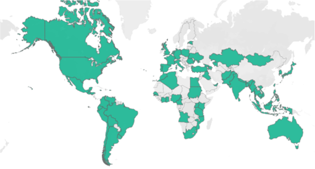
Map of the 67 countries included in the KAP-COVID Study from the dashboard (Source: KAP COVID Dashboard)
Designing a Visualization Approach
The team wanted to make the survey results widely accessible, but the full dataset from the initial 67-country study was massive.
Creating a dashboard with every measure and disaggregation was likely to overwhelm many users. With the more granular data for all questions available on request, the aim of launching the dashboard wasn’t to provide every single data point. Instead, it was to focus on key knowledge, attitude, and practice insights with helpful links to health communication resources that could be used to address gaps in the adoption of prevention behaviors.
To summarize the data, researchers calculated weighted scores by demographic group for 51 different measures, as well as additional variables, to better understand the interaction between behaviors. For example, what share of people who didn’t believe masks were an effective way to prevent COVID reported wearing a mask anyways.
To focus the data visualization efforts, the cross-functional team of researchers, communicators, and data visualization experts prioritized two key audiences who could best use the survey results: country policymakers and health communications experts. Then, the team mapped out critical questions these two audiences would need to answer and narrowed the variables to display those that were most actionable.
Purposeful Design Decisions
The team had two priorities in creating the series of dashboards to explore the KAP COVID data. First, to take a user-centered design approach focused on policymakers and health communicators. Then, to ensure design decisions in the chart selection, layout, and interactivity aligned to data visualization best practices, while keeping those key audiences in mind. Here are three principles the team followed when constructing the dashboards.
1. Create mental models with repeating chart types
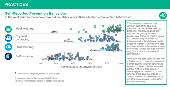
On the global view, where users are focused on comparing scores for different countries, the team used jittered dot strip plots with the option to highlight a country of interest. In both cases, using a repeating chart type — interspersed with other visual elements — enables the user to “learn” how to read the chart in the first view and then apply that mental model throughout the dashboard.

Jittered dot strip plot of attitudes towards COVID-19 from 67 countries (Source: KAP COVID Global Dashboard)
On the country dashboard, with disaggregated data by demographic groups, the team selected dumbbell plots to emphasize the difference between values for pairs of demographic groups.
2. Details (and more subject matter expertise) on demand.
In designing the various visualizations, the team followed the mantra of providing the big picture first, then enabling the user to zoom and filter to access more details on demand.
For each view, users can click on a small magnifying glass, which provides insights on how to interpret and apply the data presented. This adds necessary context for users who may find the data interesting, but then think, “so what?”
Self-reported adoption of COVID-19 Prevention Behaviors from 67 countries with expanded ‘how to read this chart’ box at right (Source: KAP COVID Global Dashboard)
3. Enable analysis with benchmarks
Many of the charts allowed users to benchmark their countries’ scores against other countries around the world or in their WHO region. In addition, disaggregated views provided median or country total values to compare with scores for individual groups, such as urban and rural populations. Without baselines for the first round of survey data, these additional benchmarks provide an added point of comparison for users as they look across different demographic groups.
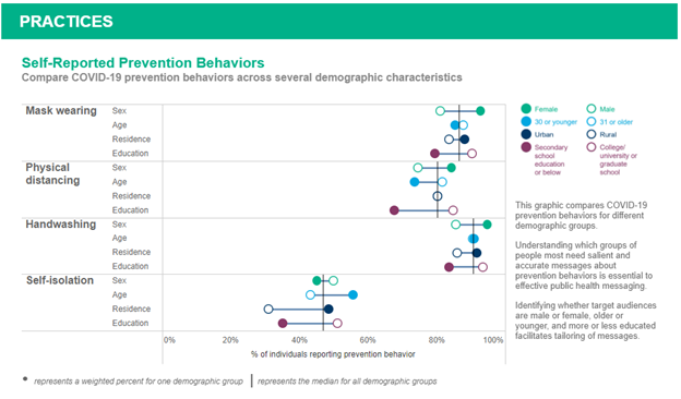
Comparing disaggregated self-reported prevention behaviors, compared to overall totals (Source: KAP COVID Global Dashboard).
In under a month since the dashboard launch, the KAP COVID dashboard has been viewed more than 10,000 times and the team has heard from policymakers who are using the data to inform Risk Communication and Community Engagement (RCCE) efforts in India, Indonesia, and the WHO’s Western Pacific region. You can dig into the data and learn more about COVID-19 knowledge, attitudes, and practices around the world, including trended analysis over eight survey waves for 23 countries, on the KAP COVID dashboards.
Subscribe to the JHU CCP email newsletter for updates when new releases of the dashboard are released.
This article was originally published on Nightingale by the Data Visualization Society and is co-authored with Marla Shaivitz, Director, Digital Strategy, Johns Hopkins Center for Communication Programs
You Might Also Like
WIP Limit Zero: How Slack Makes Us More Creative
Doing nothing gives us the space to develop focus, process our experiences and find the...
Pandemic Response: Succeeding with Agility
McKinsey recently published an article that differentiated between ‘agile’ organizations and less agile ones. They...
Exploring the Complexity of Visualizing COVID-19 Case Data
Over the last four+ months, the world has logged on daily to track case counts...