Excellian Hunter Tammaro created this tool to illustrate the inner workings of a Monte Carlo project forecast and to serve as a starter for forecasting real projects. It’s built to be extensible – users can adapt and remix it to meet the needs of their own context. Think of it as a chemistry set for forecasting: it will help you learn the basics and help you go beyond them.
The worksheet is available in both Excel and Google Sheets formats.
The worksheet is set up to forecast the likely completion dates for a team working off a backlog of a given size based on its recent delivery rate, as described in this blog post. Once a user chooses their inputs, all the simulations are run and outputs compiled using simple Excel formulas – no coding required. Users can quickly see how different inputs affect the forecast, making it especially well suited for “what-if” forecasts.
Users are encouraged to study the formulas and adapt them to run different types of forecasts. For instance, with just a few tweaks, the same worksheet can make predictions based on a team’s throughput instead of its takt time, or estimate the scope of work that can be completed by a fixed date.
The workbook is divided into three sheets: Inputs, Simulations and Results.
The worksheet only requires a few simple data points to create a forecast.
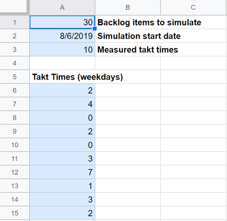
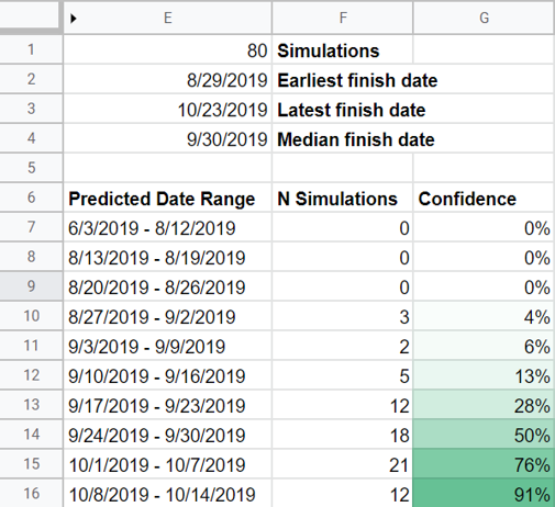
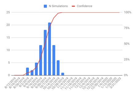
That’s it! As soon as your data is in place, your forecast has already run.
This is where the magic happens. Each of the 4,000 rows represents the completion of a potential future work item, numbered in the PBI Number column. In the Simulated Takt column, a formula chooses one of your measured takt times at random to represent how long it could take to complete the item. In Run Total, another formula checks whether enough work items have been simulated to deliver the backlog size you chose, and add up the total time to complete if so. Then the process starts over again in the next row.
This sheet is all formulas – there’s no need to make any changes to it until you’re ready to start customizing the forecast.
Here, the workbook summarizes the simulations for you.
In the small table up top, the workbook tells you how many Simulations it was able to run – roughly the number of simulated work items divided by the size of the backlog you simulated. You can think of this as the resolution of your forecast: more simulations paint a more precise picture of the future. If you need more precision, just extend down the formulas in the Simulations tab by another thousand rows or so. The summary here should automatically detect the additional data.
The rest of the first table sketches the broad contours of the results: the Earliest, Latest and Median finish dates forecasted. I wouldn’t report any of these as “the forecast” if I were you, but they’re useful for quickly comparing the results of different scenarios.
The larger table is the heart of the forecast. For each week-long Predicted Date Range, the table shows how many simulations fell within that range (N Simulations) as well as the percentage of simulations that were completed by the end of that range or sooner (Confidence). You can read the example pictured, for instance, as “I forecast a 91% chance the team will complete its backlog by October 14, 2019.” See? You sound like an expert already.
The worksheet also plots the same data as a graph. This is useful for identifying more subtle features of the forecast. For instance, are the results tightly clustered around a likely date, or more spread out? It’s also a good way to tell if you have the level of precision you need. You want a clear “bell curve” shape like the one shown here. If there’s more noise in the picture, you may need to run more simulations.
Try out the forecaster as an Excel workbook or a Google Sheet (don’t forget to download or make a copy before you get started). The three sheets are protected so you don’t accidentally break a necessary formula. When you’re ready to start customizing them, just unprotect the sheets – there’s no password.
If you have questions, ideas, or just want to show off a cool customization you made, get in touch! You can reach Hunter by email, on LinkedIn, or on Twitter.
The Risks of Insecure YAML Deserialization in Python
YAML is a python favorite for object serialization, especially around application configuration. So, it is...
Agile eXamined: The Sprint Goal
Daily standups, acceptance criteria, user stories, retrospectives…am I right Agilists? In the day-to-day, it’s easy...
Contextualizing Responsible AI Practices for Fraud Detection
Developing and sharing Responsible Artificial Intelligence (AI) practices are a key element in protecting the...